Architectural modernism
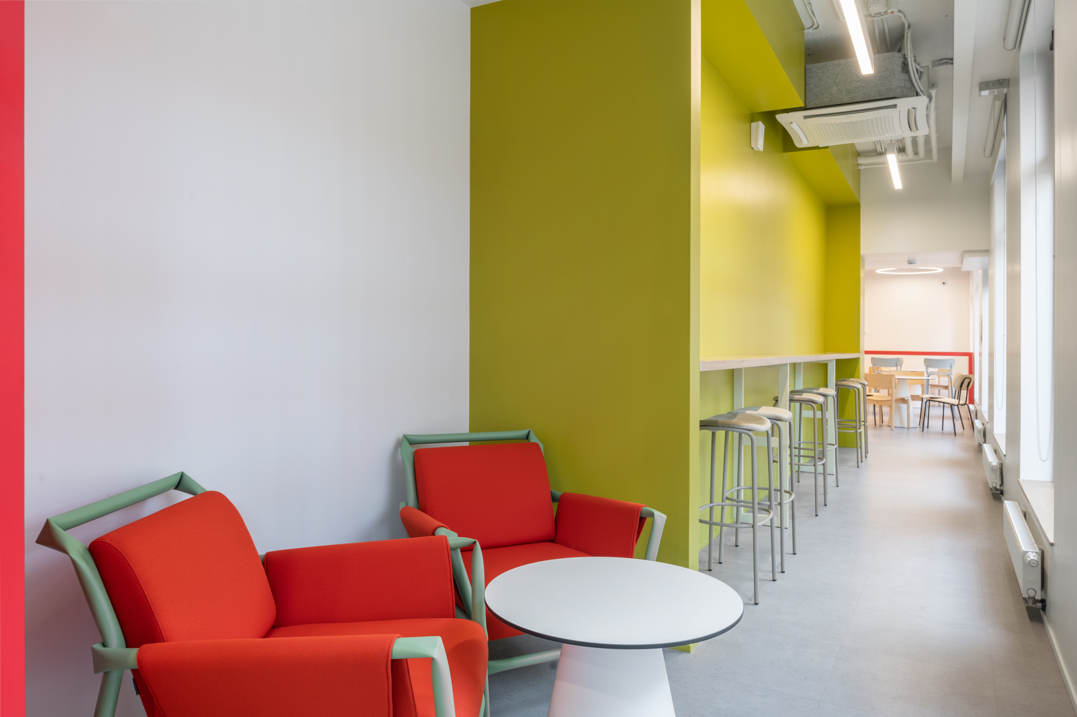
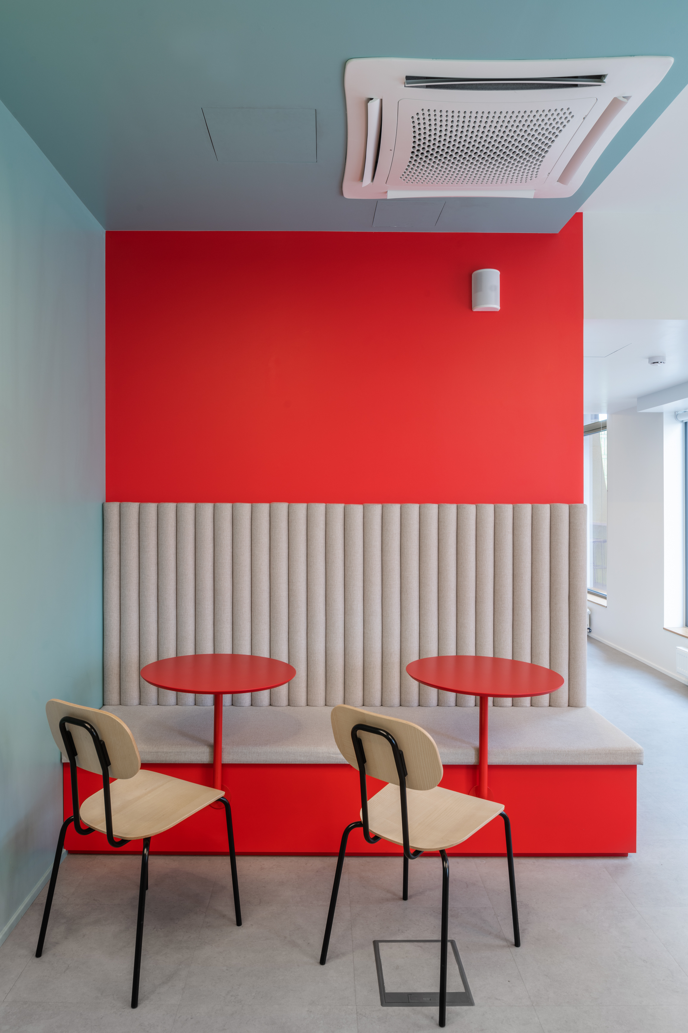
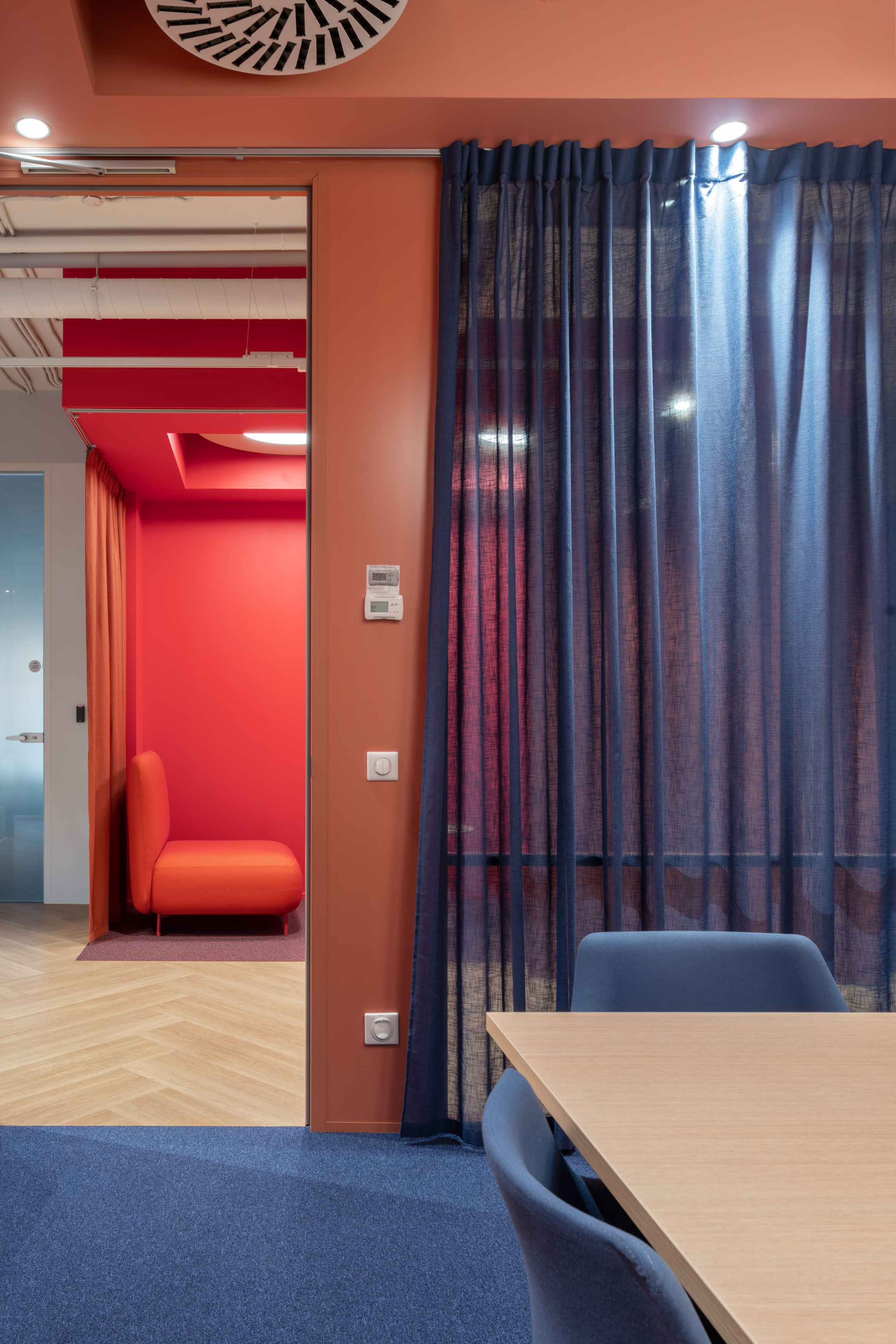
The key features of the concept are large one-color rectangular volumes and protruding cylindrical elements, color shading and complex color combinations. Looking ahead, let's say that the OFFCON idea was implemented almost unchanged - only those elements were simplified in the work, the delivery and installation of which required a lot of time.
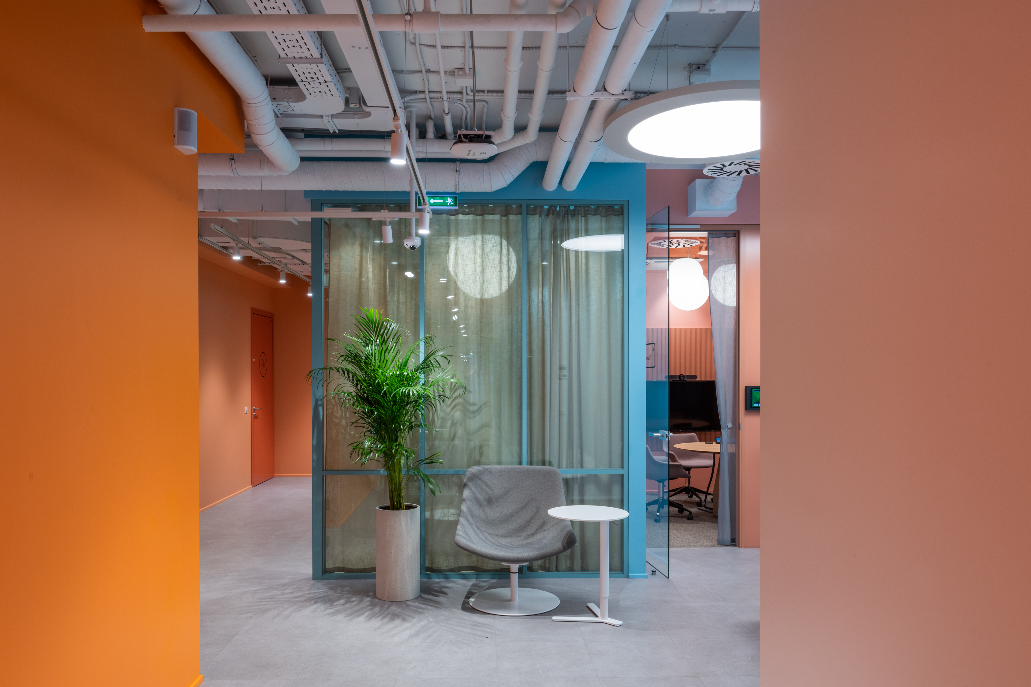
“The original floor plan provided for a monotonous central corridor and small sections of offices. The block of bathrooms is poorly located - directly opposite the only entrance to the floor, which reduced to zero all chances of placing a welcome zone in this place. At the same time, one of the main tasks in the planning was "to leave the corridor-cabinet system, while avoiding a long monotonous corridor." Therefore, we applied our favorite trick in OFFCON, turning the lack of space into a virtue. First, they complicated the space and made the viewed parts not so long. This technique visually makes the scale more proportionate to a person. Then we broke the straight form of the corridors by moving meeting rooms and lounge areas into it in different parts of the office. Hence the reference to the theme of modernism was born - instead of masking volumetric solutions, we decided to emphasize them using characteristic shapes and colors,” GAP explains.
Logistics and opportunities
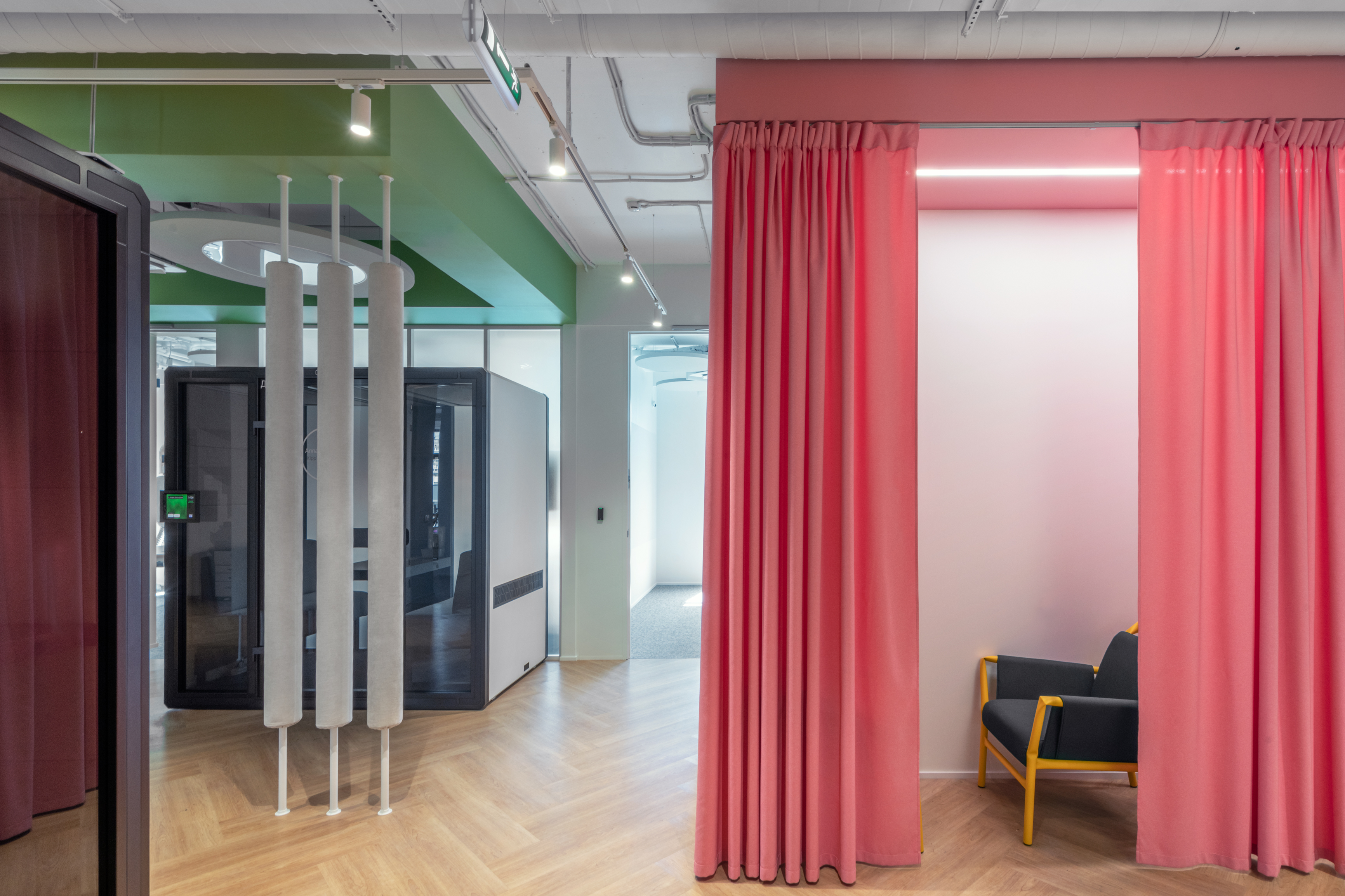
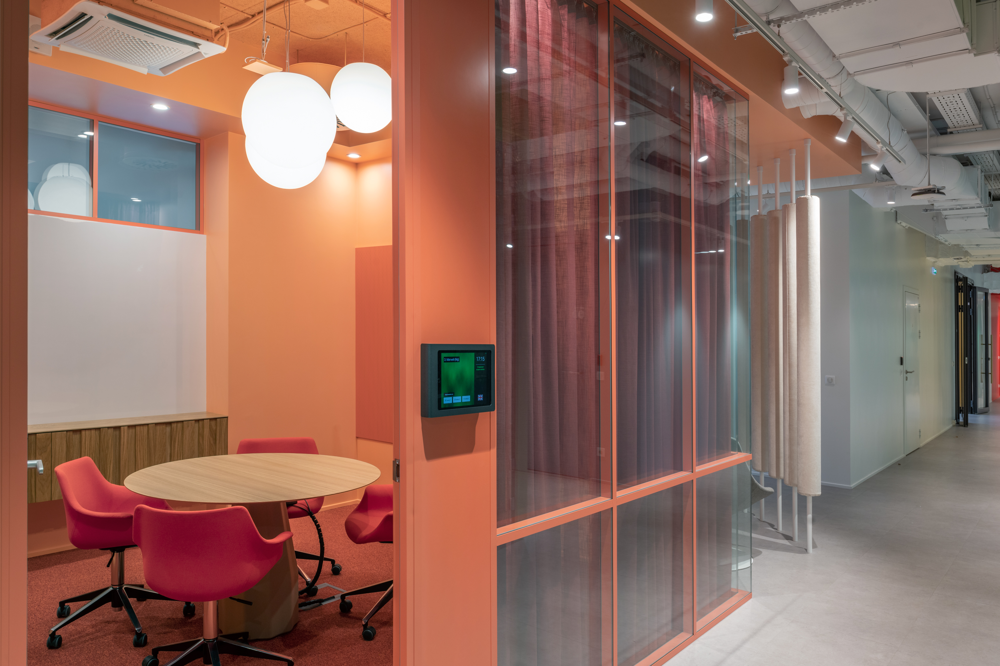
All logistics in the office are built around the axis of the main passage, in which lounge areas and meeting rooms are located - from it there is access to all premises.
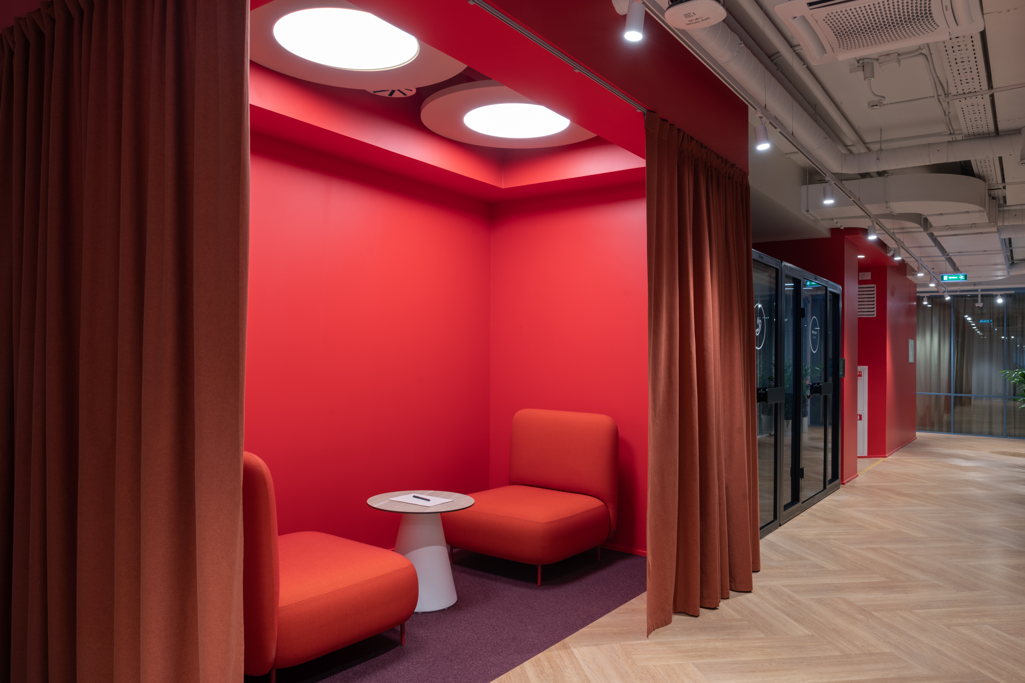
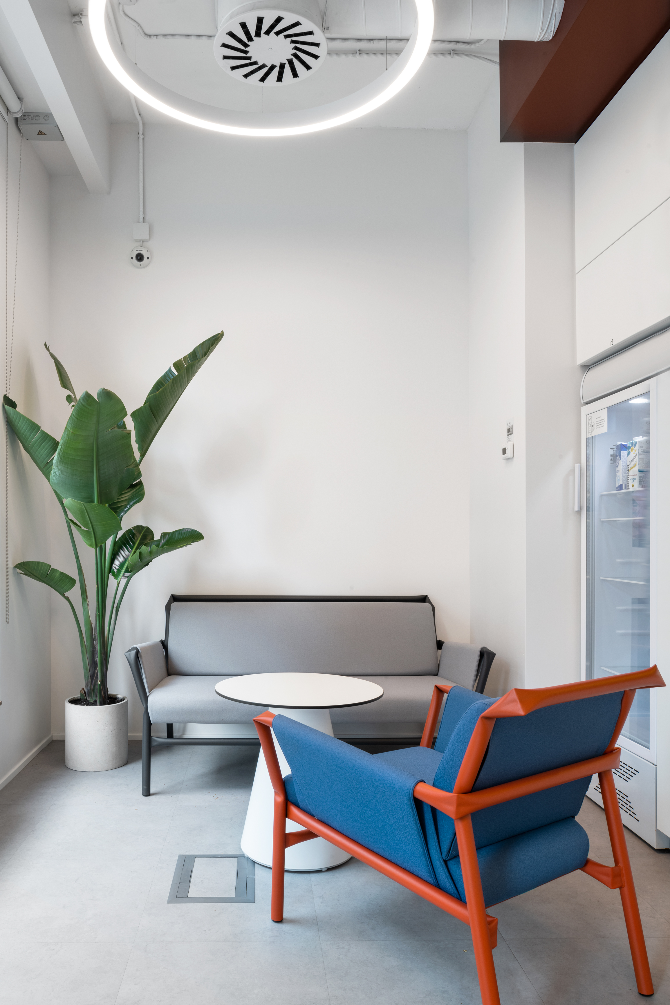
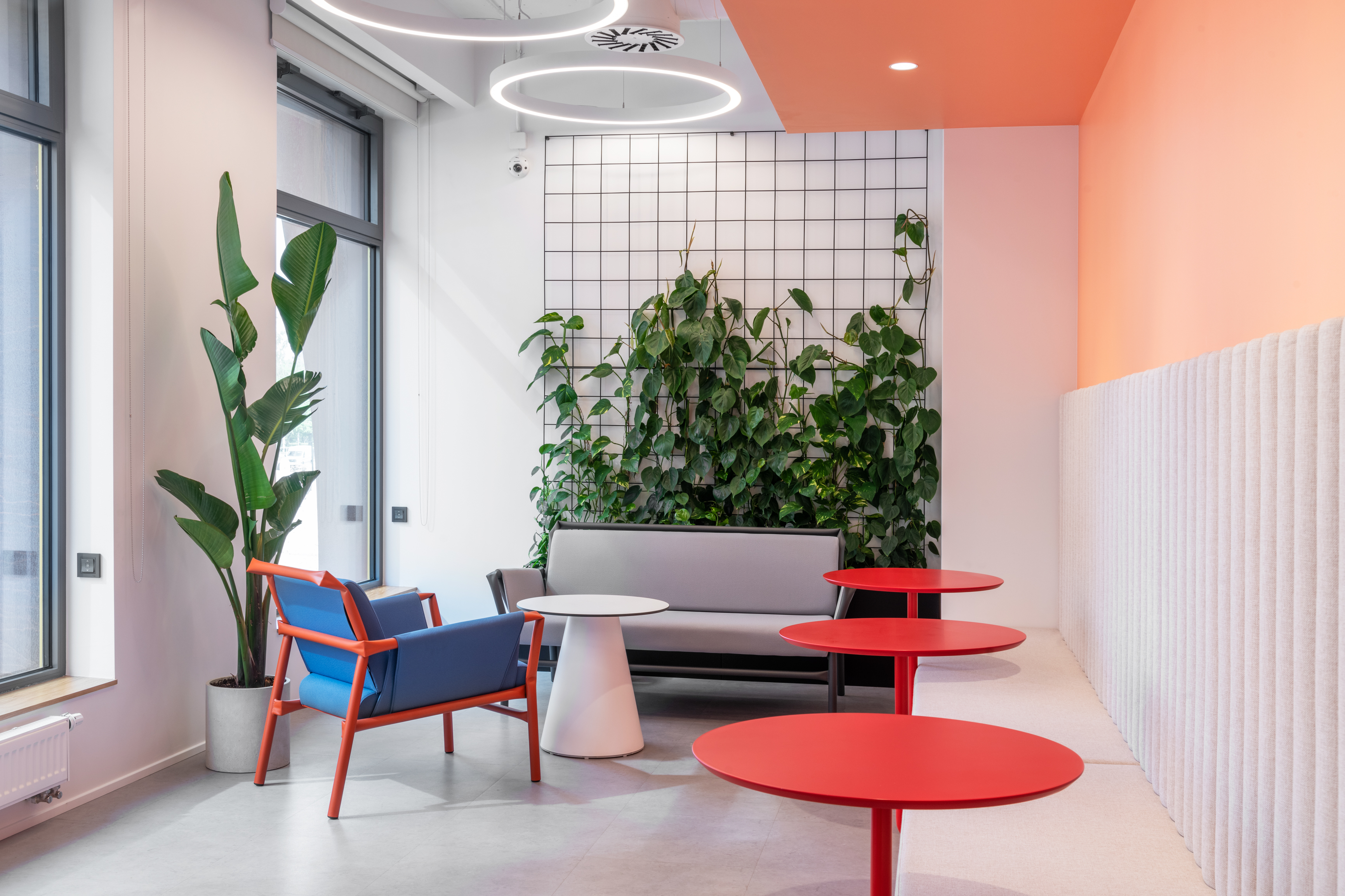
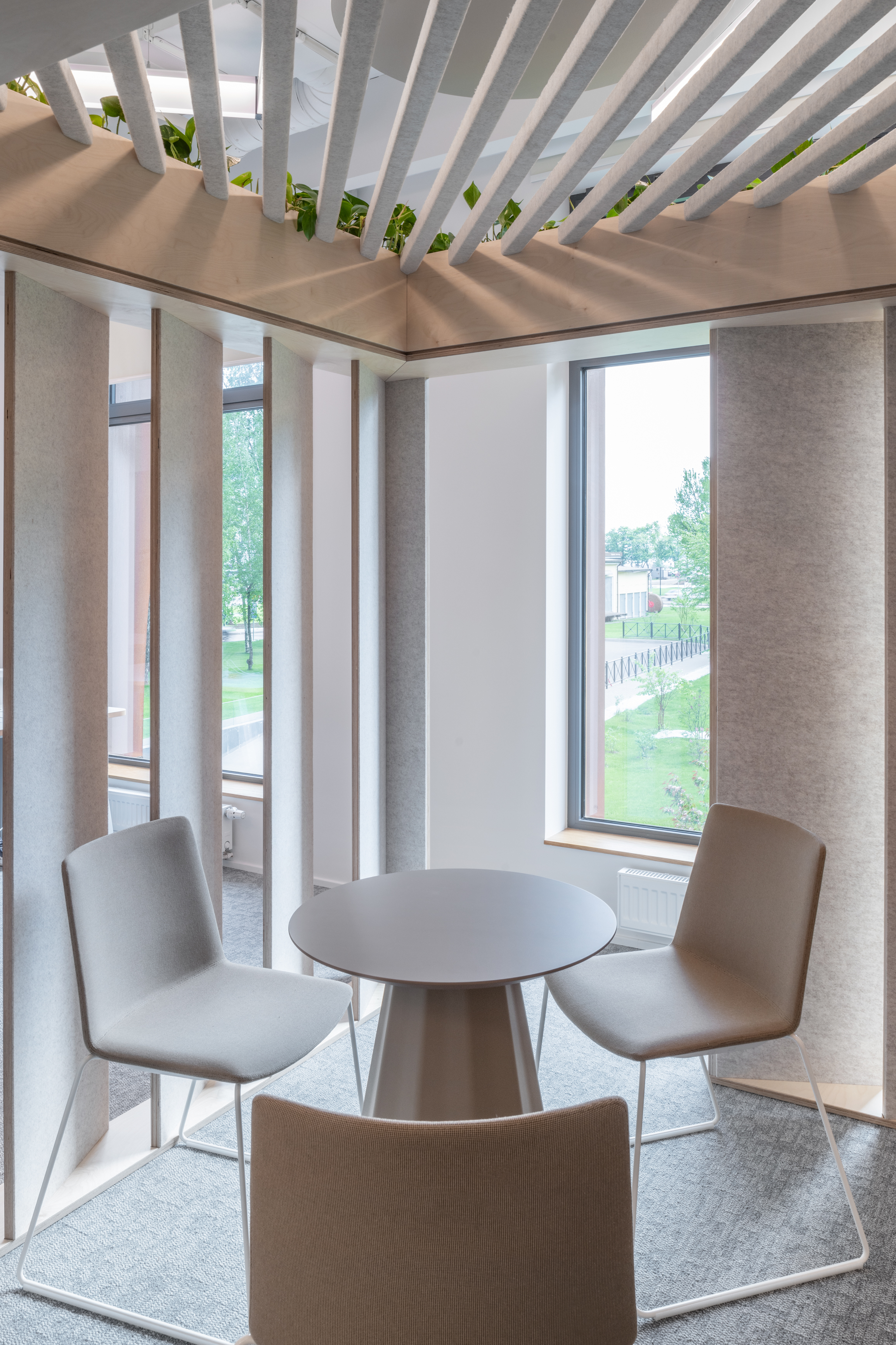
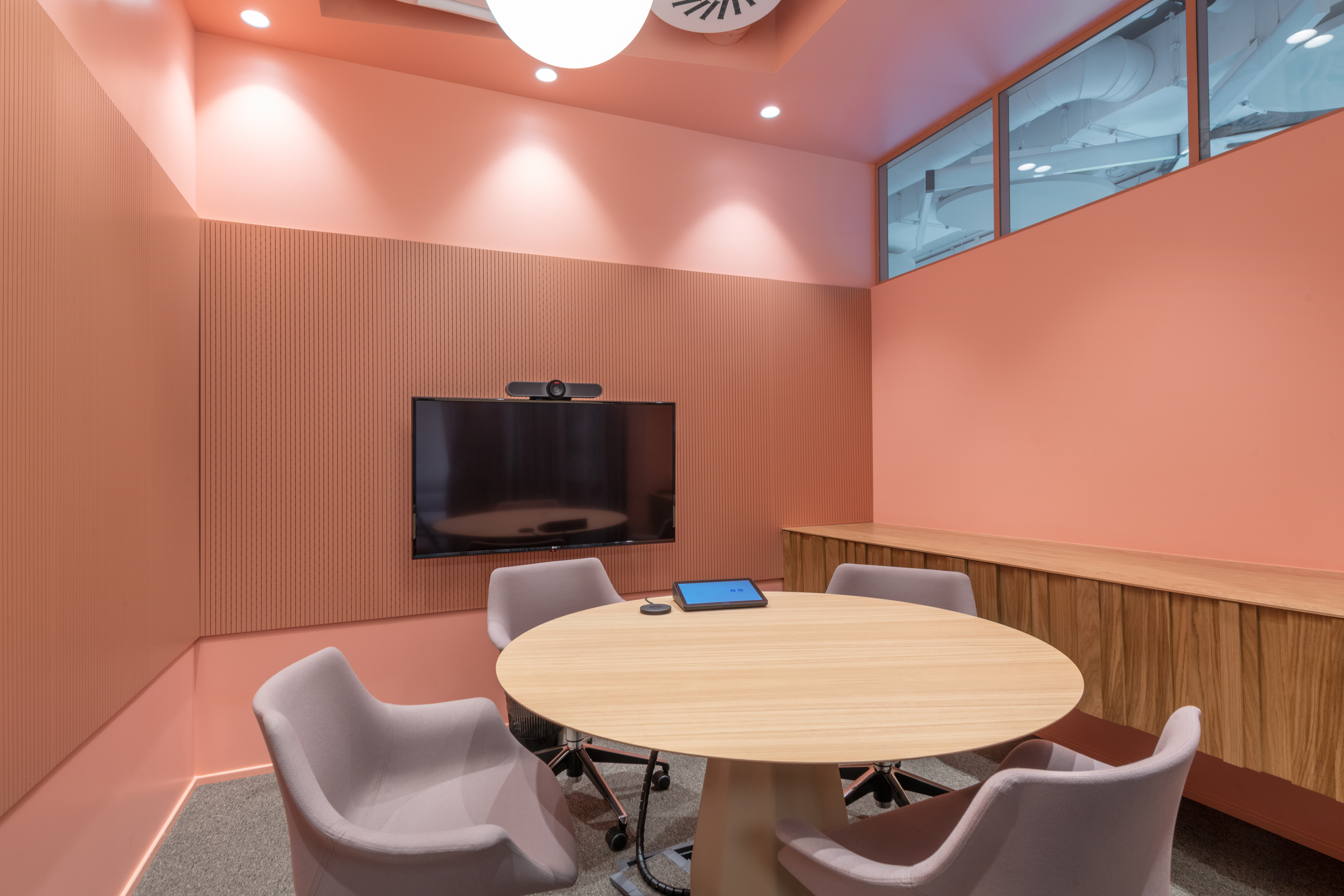
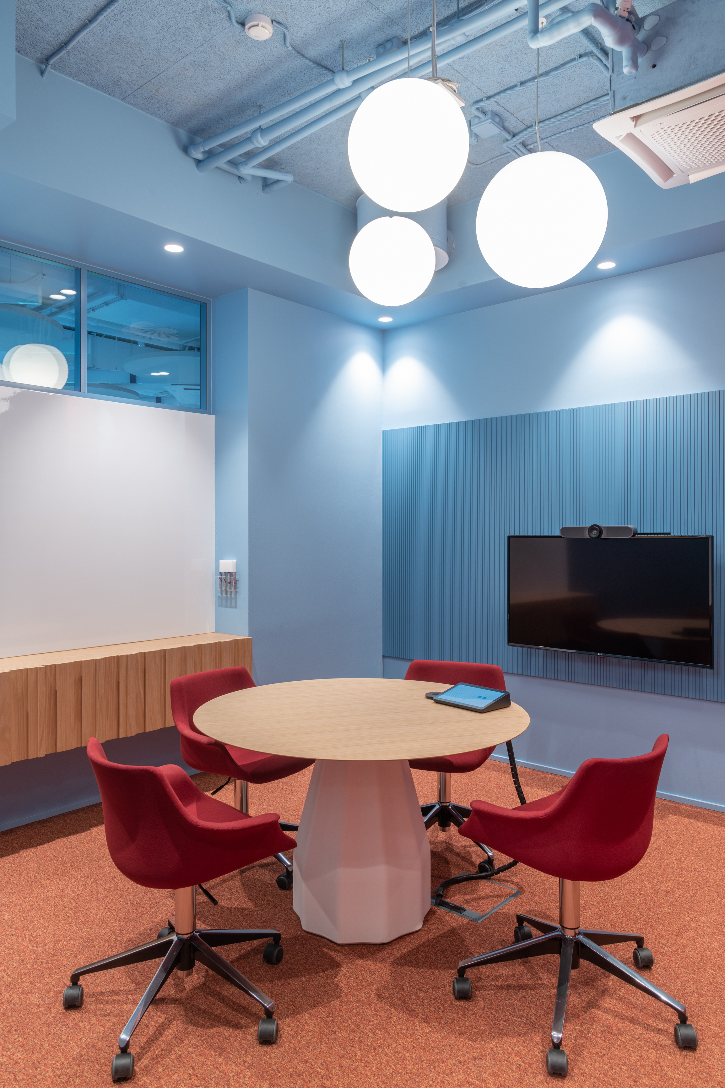
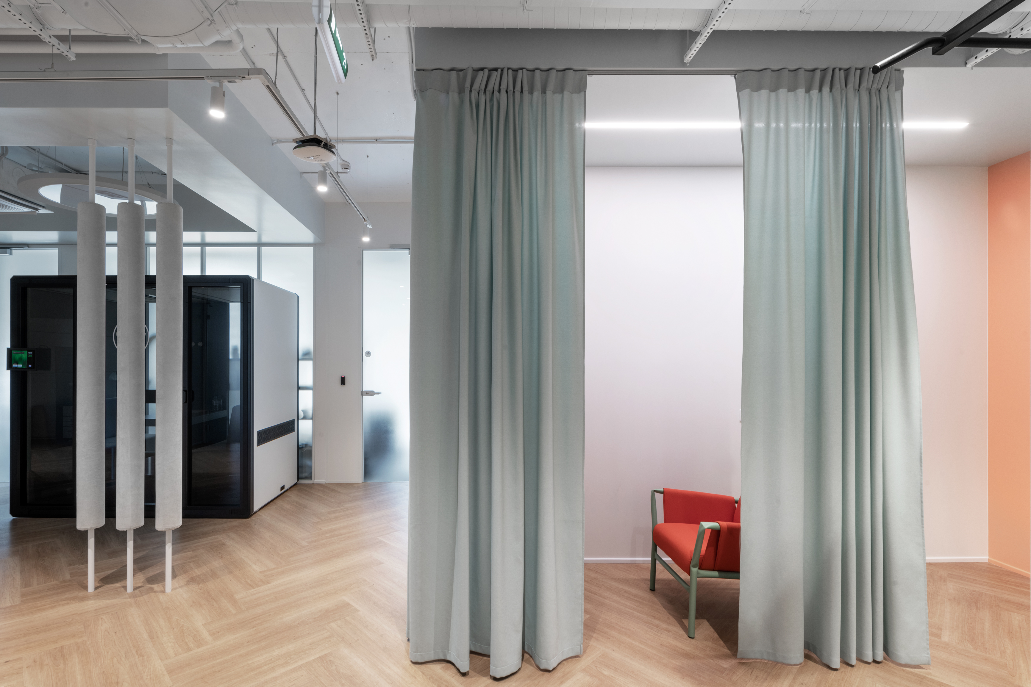
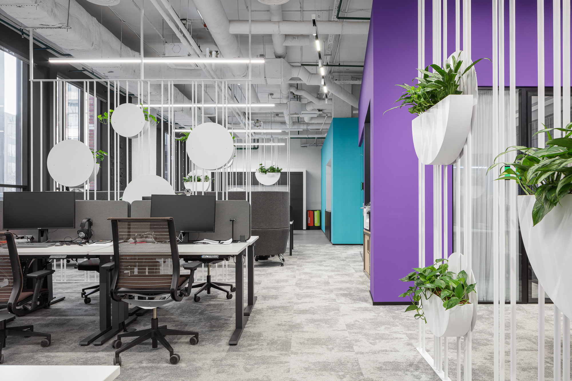
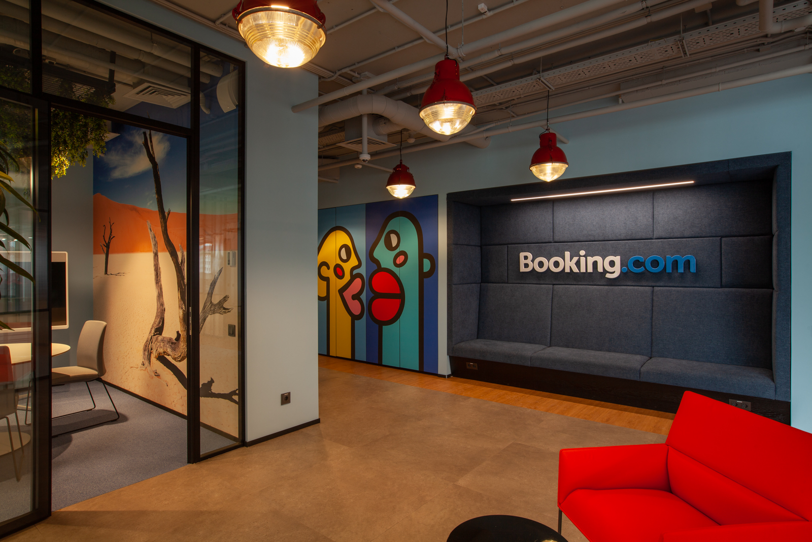
The office space is built in such a way that employees can be distracted and switch from work issues to their own comfort, and then return to the tasks set for the day. All workplaces in the office are assigned to specialists in the offices. These are rooms of different capacity - from 4 to 24 people. The office has meeting rooms and booths, soundproof telephone booths for individual conversations, as well as several lounge areas, large coffee points, a doctor's and massage therapist's office, showers, horizontal bars and a billiards area.
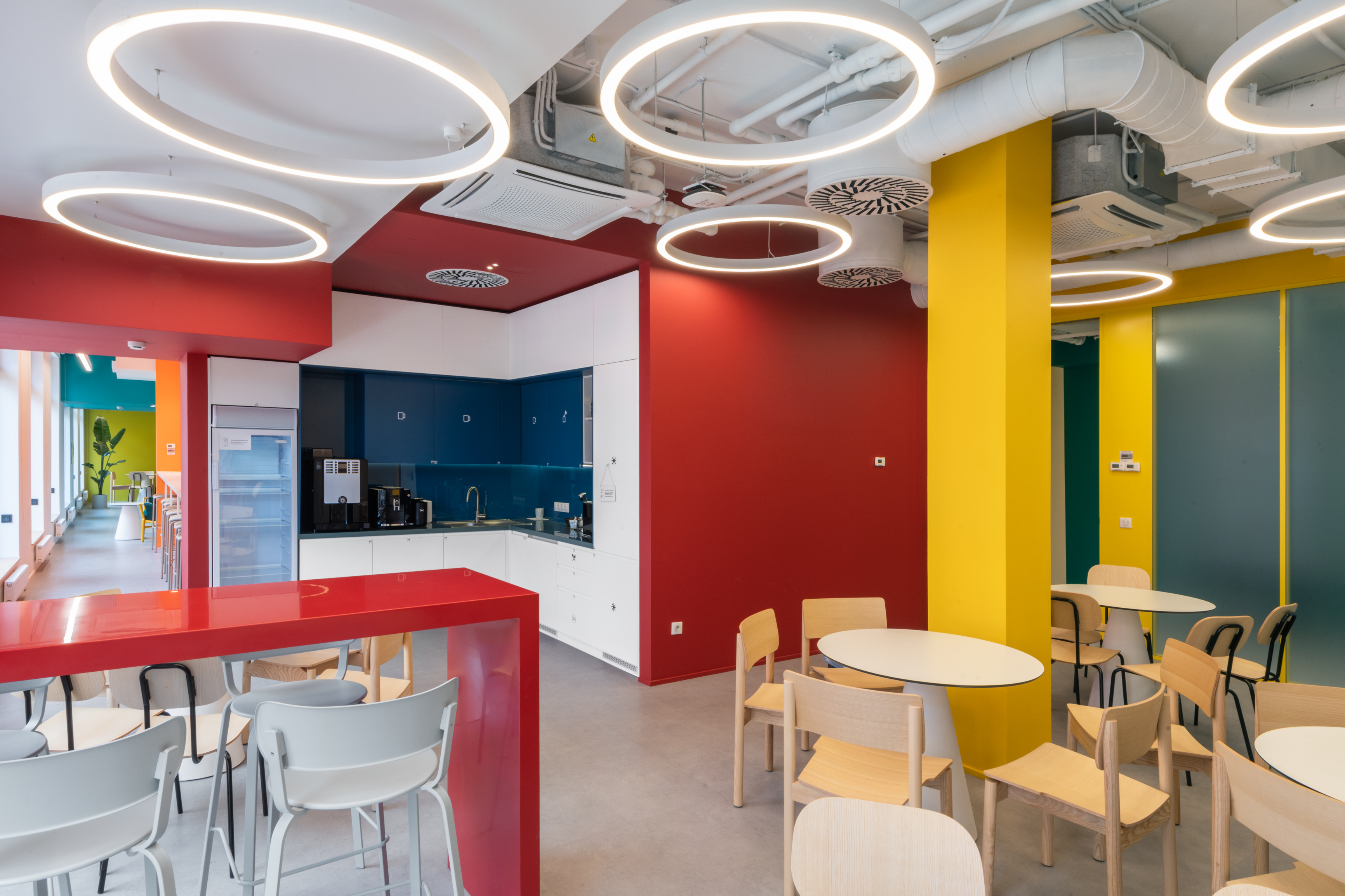
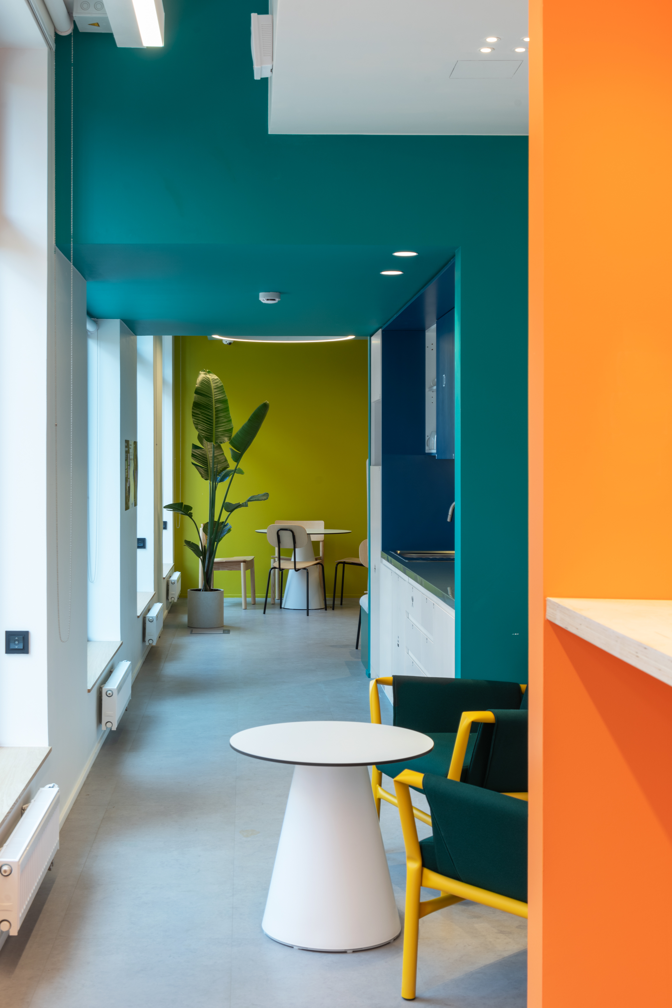
The main point of attraction for each floor was the central core opposite the entrance area, where large coffee points are located, as well as auxiliary support rooms. The traffic of employees and, accordingly, all the noise is drawn here. According to the color concept, these are the brightest and most saturated in color zones. The farther you go into the work area and the quieter work is supposed to be there, the more the color is muted and it becomes less and less. This, in particular, works as subconscious color navigation: the brighter, the louder, the more people.
Color
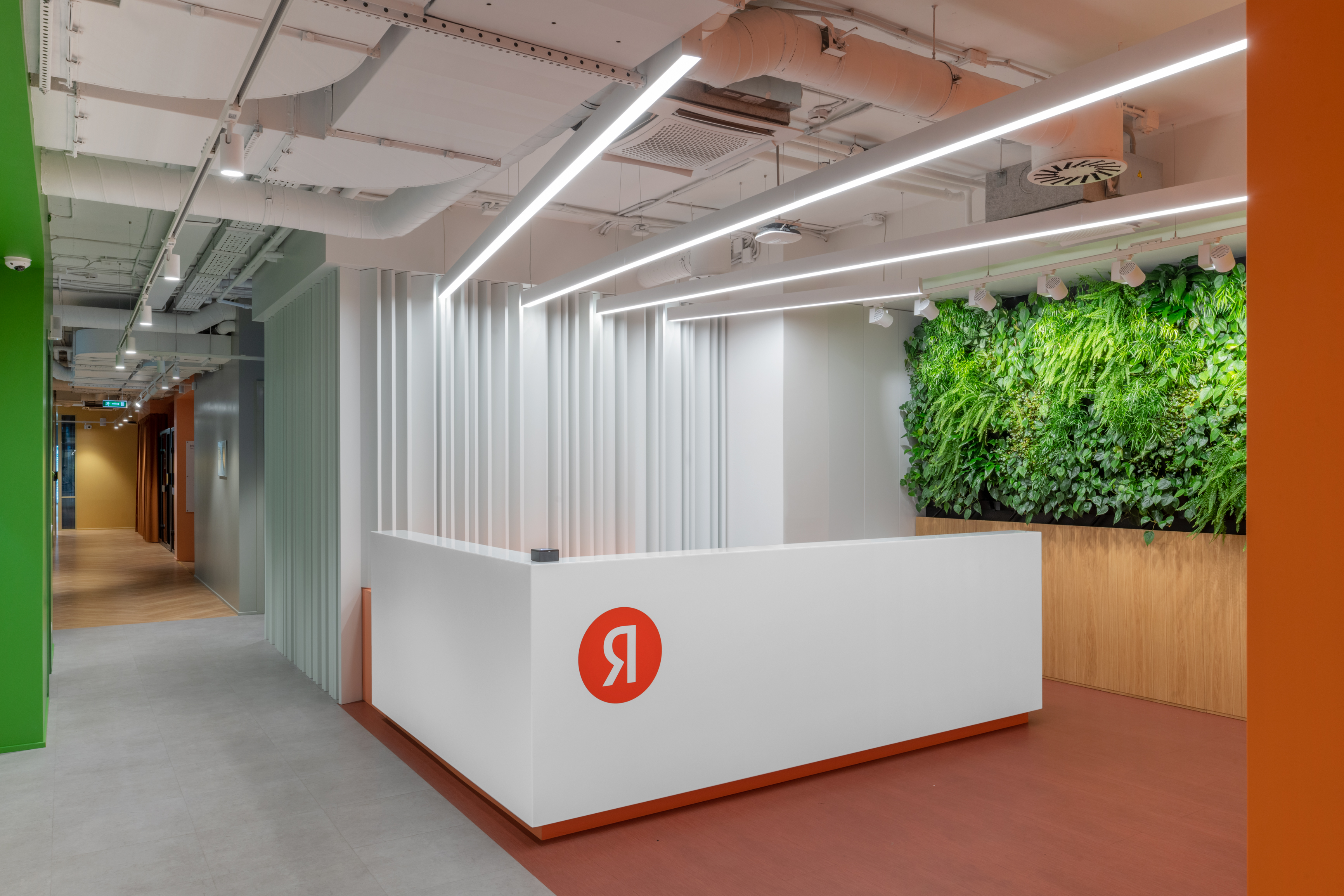
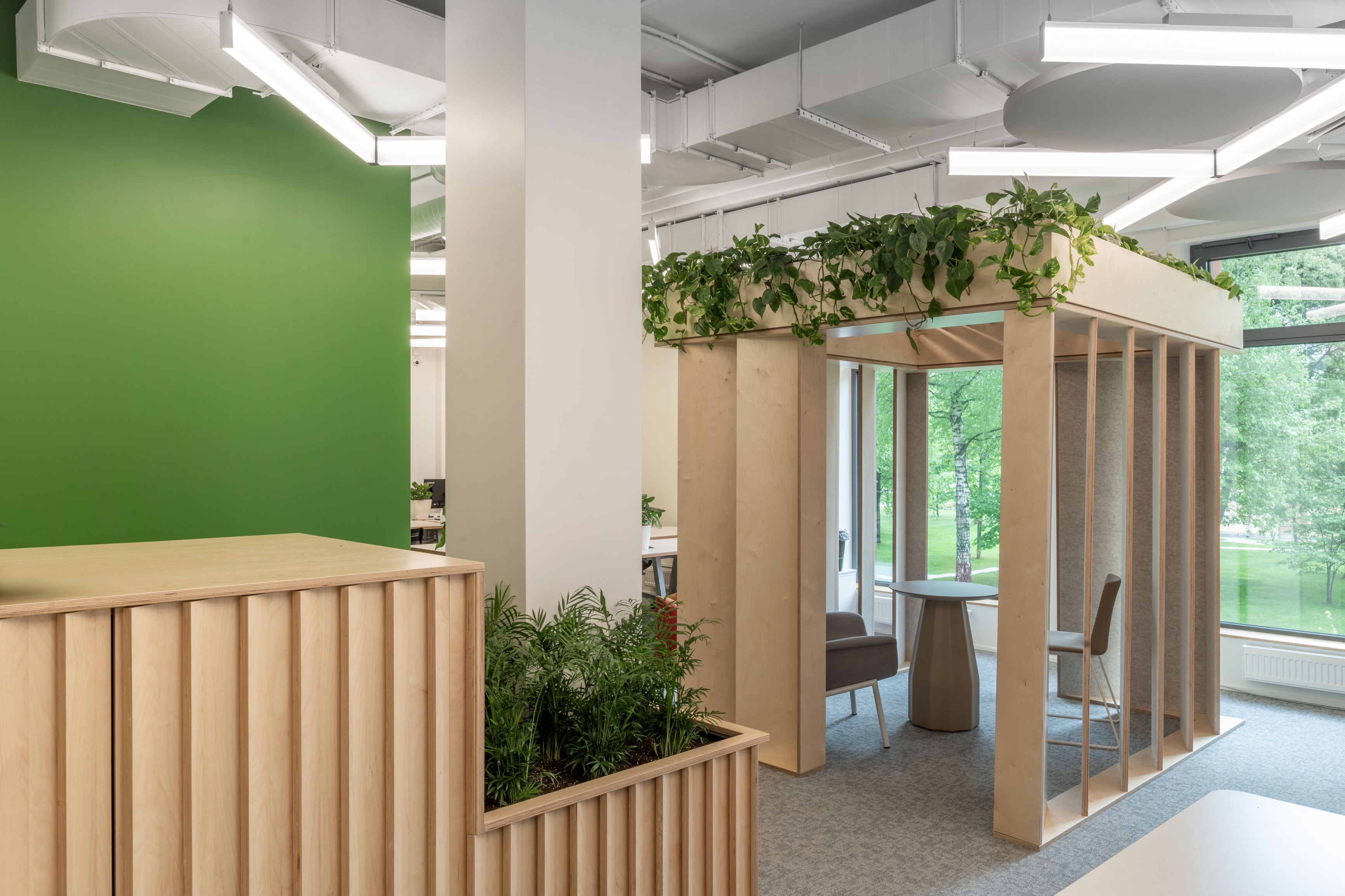
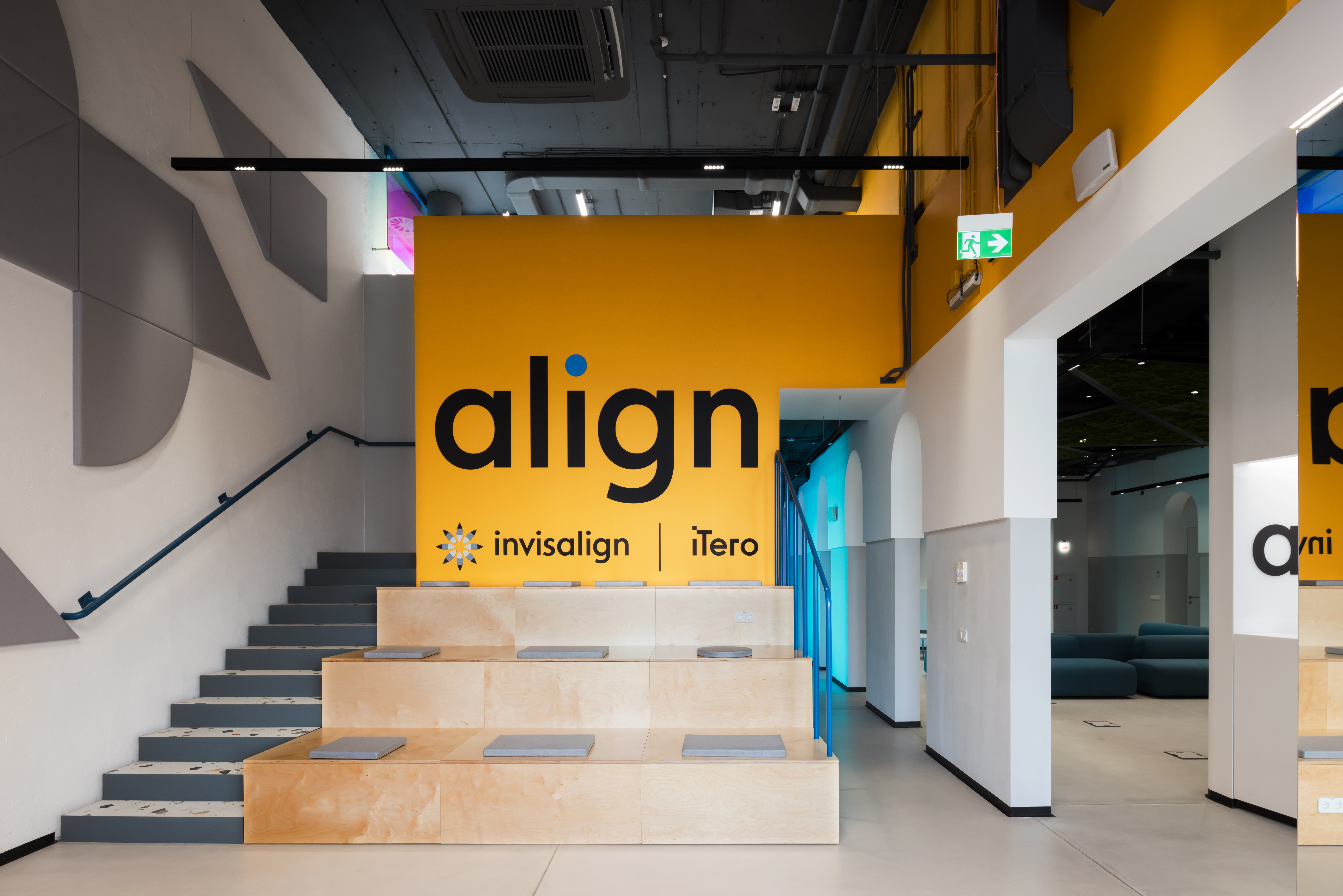
The main color accents are concentrated closer to the entrance to the floor, according to the same principle, but on the second floor, the reception is located. In this zone, unique solutions for the project were applied - a textured wall and vertical gardening. There is also a help machine - a vending machine with electronic office consumables (keyboards, mice, flash drives, etc.).
“The more employees pass through the space, the more unpretentious and resistant materials are used in it: closer to the entrances and in coffee points, that is, areas of high traffic, the texture of concrete prevails, bright color, and fragile finishes are minimized. The further into the interior of the office, the more comfortable and warm the feeling of the applied material becomes - fabric, wood (veneer and plywood) appear, in the working spaces - carpet on the floor, ”says the architect.
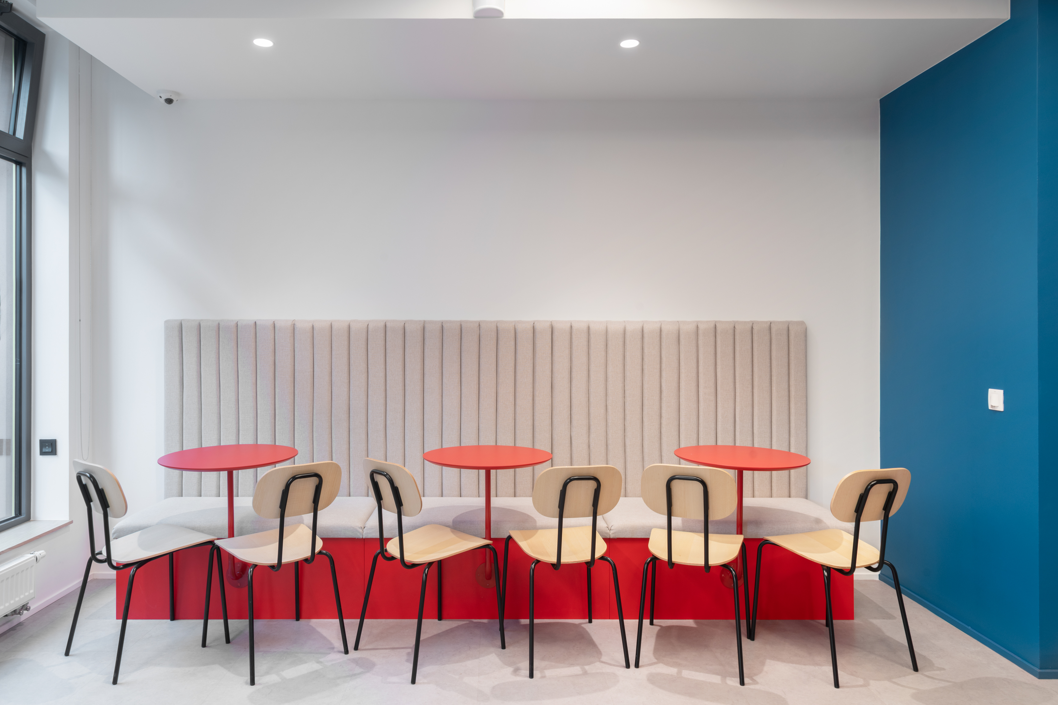
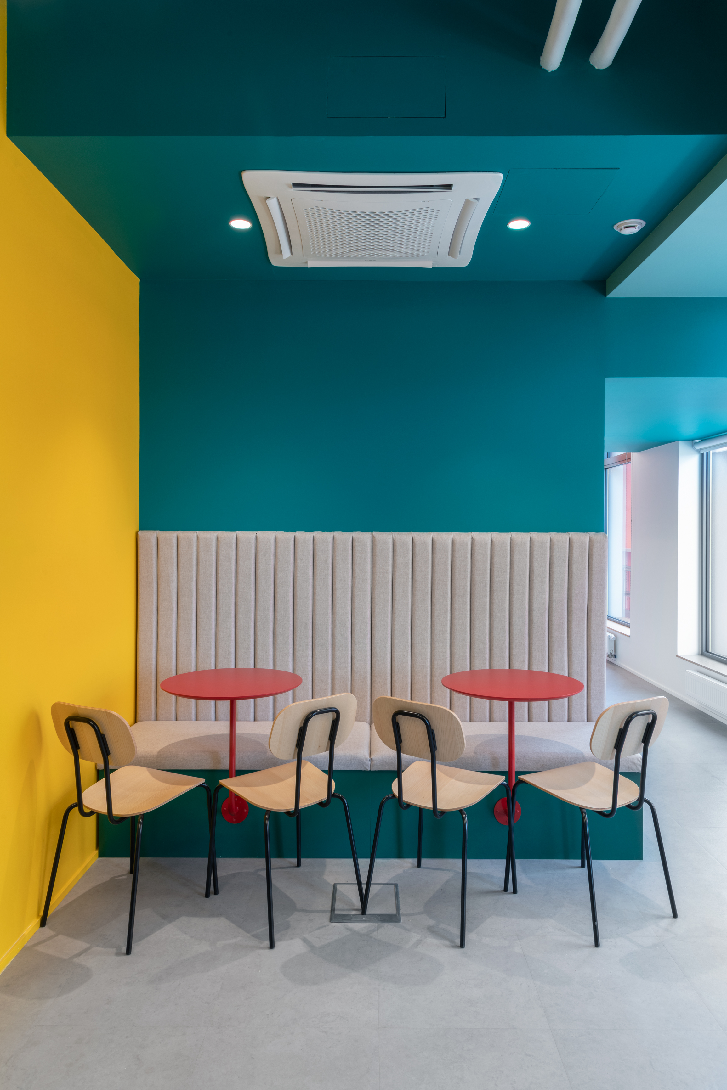
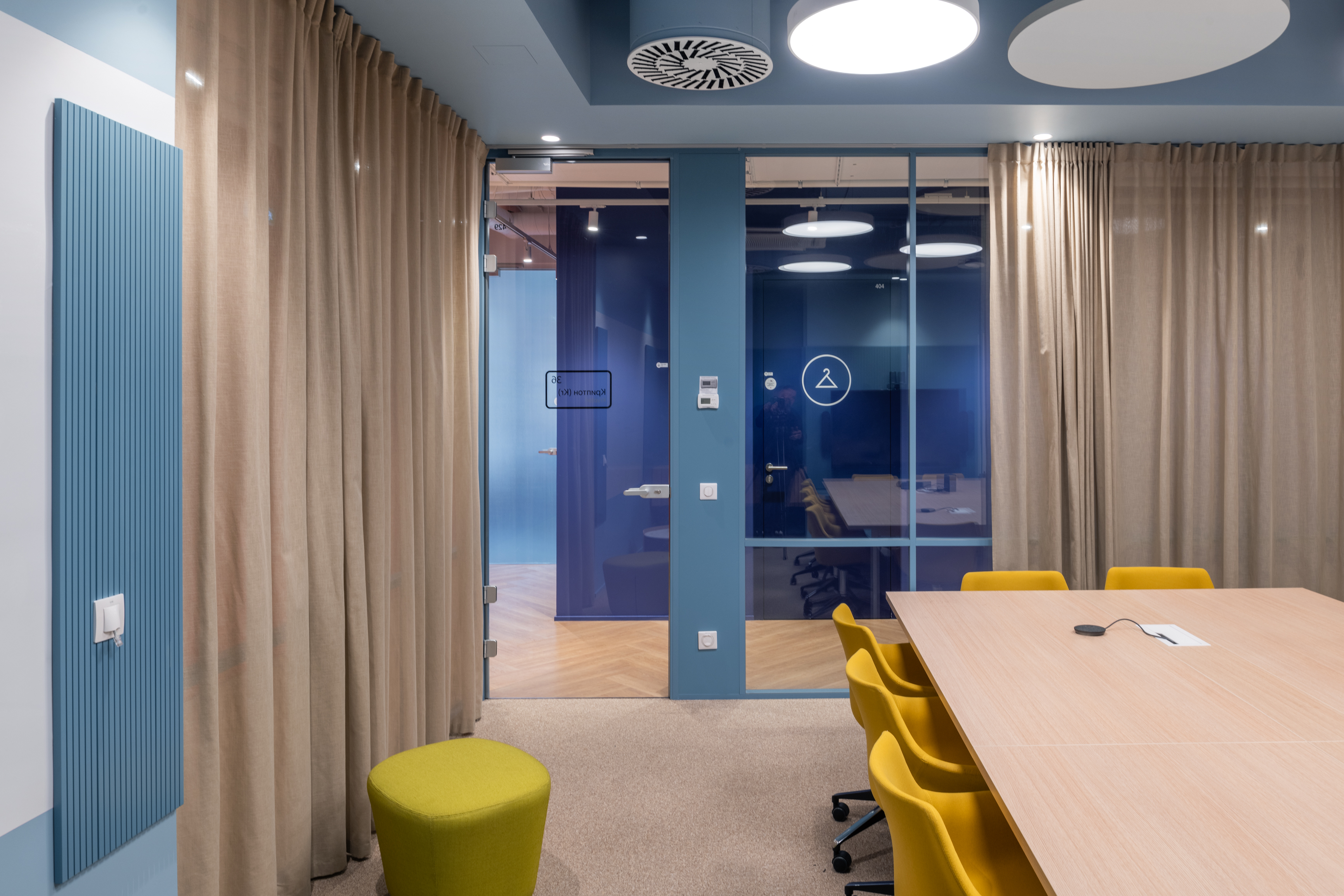
The color finish of the office space is also inspired by the era of modernism. The basis was the palette developed by Le Corbusier - slightly muted, but contrasting colors, considered as a factor influencing human physiology.
The concept contains a variety of shades selected to combine with each other. But without using all the colors. For each floor, three main shades are distinguished, for each of which, in turn, three additional ones are selected. In this case, two neutral base shades are used to balance the color throughout the project.
The color saturation decreases with distance from the core of the floor - the main entrance from the elevator hall. Based on the fact that in volumetric use the total painting of planes in one color can overload the space, only certain surfaces are painted over, and general views are diluted with neutral white, a texture appears.
Light
In the lighting solution, the main factors were manufacturability and comfort for the workspace. To create uniform illumination in the offices, the architects designed a grid of linear lamps. It gives the best result. In other areas, lighting, in addition to its direct purpose, also has a decorative function - it creates a bright space through the use of simple but effective solutions.
OFFCON Principal Aglaya Van-Van-E: “We were very pleased when the customer evaluated and agreed on the proposed concept. Another pleasant moment was the choice of the building. The project turned out bright and incredibly complex in color. We will remember many coloristic decisions and will use them in the future.”